The tools and techniques most commonly used in Quality management and process improvement are:
- Cause and effect diagram
- Control Charts
- Histogram
- Pareto Charts
- Flow chart
Cause and effect diagram
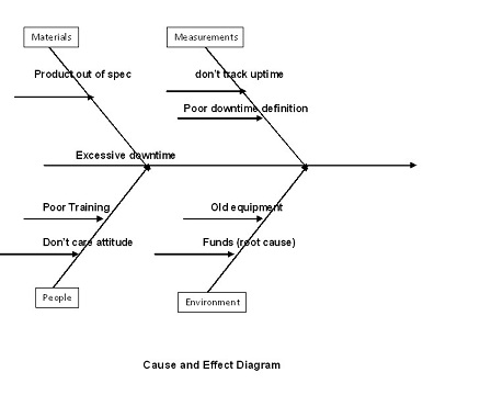
 Cause and effect diagram is very helpful to find the root cause of the defect. Cause-and-effect diagrams show the relationship between the results of problems and the root cause of these problems. This diagram shows all the primary and secondary causes of a problem and the effect of all the proposed solutions. This Ishikawa diagram is also called fishbone diagram due to its fish-like shape. In the above diagram: poor training, old equipment, funds are the causes and “Excessive downtime” is the effect.
Control Charts

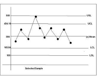
Let’s assume from a sample you have determined the measurement that mean is 300 and the standard deviation equals 44.72. Three standard deviations on either side of the mean become your upper and lower control points on this chart. In this case 3 standard deviations is equal to 300 +- (134.16). Therefore, if all control points fall within plus or minus three standard deviations on either side of the mean, the process is in control. If points fall outside the acceptable limits, the process is not in control and corrective action is needed. UCL and LCL are Upper control limit and lower control limit respectively. USL and LSL are upper specification limit and lower specification limit.
Histogram

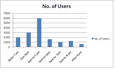
Consider the following example: The following histogram shows number of hits on the company’s website in different time of the day. The x-axis shows the number of users or customers active on the website and the y-axis shows the time of the day.
Pareto chart

Flowchart
Flowcharts are logical steps in a logical order so as to accomplish an objective. Flow charts are drawn with the use of geometrical objects like rectangular, rhombus, parallelogram, activities, decision points to in a process. Flowcharting can help identify where quality problems might occur on the project and how problems happen. There are different software tools in the market today for drawing flow charts, such as MS Visio.
The quality policy is a guideline created by the top management that describes what quality policies should be adopted by the project team, in line with other companies. These tools and techniques are very helpful for a project manager to understand it and incorporate it and deliver a quality product.
- Top 45 Fresher Java Interview Questions - March 9, 2023
- 25 Free Practice Questions – GCP Certified Professional Cloud Architect - December 3, 2021
- 30 Free Questions – Google Cloud Certified Digital Leader Certification Exam - November 24, 2021
- 4 Types of Google Cloud Support Options for You - November 23, 2021
- APACHE STORM (2.2.0) – A Complete Guide - November 22, 2021
- Data Mining Vs Big Data – Find out the Best Differences - November 18, 2021
- Understanding MapReduce in Hadoop – Know how to get started - November 15, 2021
- What is Data Visualization? - October 22, 2021

Your blogs quality management tools and techniques is very informative and I gain my knowledge more.
Where the citation of this lesoon